Research Goals
1. Improve the user experience
2. Increase conversion rate
Research Questions
1. What frustrates the users?
2. What's the user journey of conversion?
3. What are users’ motivations for converting.
4. What are the discrepancies between users’ expectations and the product page itself?

PROCESS
Overal Timeline
Phase I: Understand users’ pain points, identify opportunities for improvement.
Phase II: Collaborate with the designer and web developer to build a new product page, test user experience on this new website.
Research Process - Phase I
.png)
1. Data Analytics
I used Google Analytics to analyze existing product metrics and user journey to identify opportunities for improvements. I reviewed existing personas to better support my decision of interview participants.
2. Participants
I used a screener survey to select participants. I divided participants into two user cohorts: existing and canceled users and planned to have three participants in each group.
3. Interviews
After the first two“pilot interviews”, I sought feedback from the project manager before moving on. I used Affinity Diagram to collect and analyze qualitative data.


FINDINGS
To deal with the large quantity of data I collected, I code and labeled recurring phrases and terms, such as the tabs and pages on the website. I then experimented with different ways to the findings. Eventually, I broke down the findings into two big categories, global and local, and synthesized significant themes under each category.
LikesOverall, visitors feel convinced by the use of statistics, language, and video on the Talent Platform page.
Motivations
The contrast between Lite and VIP is the number one force driving users to choose Complete package.
Pain points
Global
1. Users’ experience gets interrupted by the pop-up.
2. Users can’t quickly find the information due to the complicated layout.
Local
1. Users don’t understand all the offers in the packages.
2. Some important services are not currently listed on the website.
3. Expectation mismatches on the “learn more” button.
4. To fully commit, visitors would like to see more concrete examples.
5. Users feel thrown away by ambiguous phrasing of price
User Journey
For explaining what the pain points and opportunities are at each step:
.png)
Reflection at this stage
LESSON LEARNED
1. Always tag the quotes, so when stakeholders view an insight, they know which user it’s coming from.
2 If I could do the analysis again, I'd separate the pain points, needs and expectations.
CHALLENGES
1. Large quantity of data: to make sure all insights and quotes are given adequate notice and are analyzed, I invented a check-box system, so I didn’t miss out anything.
2. Rich data: I broke down the themes and at the same time generalized them into bigger problem statements. I also to learned not go too concrete into one finding.
3. Contradicting data: I was able to include contradicting data by fitting them into different themes. I also made sure to not leave out data that don’t align with my own viewpoints.
RECOMMENDATIONS
1. Interviewed the stakeholder before finalizing recommendations
I did so to ensure business needs are satisfied as well as user needs.
2. My recommendations:
I divided the recommendations into Quick-Win and Long-Term.
Quick-Win:
1. Change the frequency of pop-up
2. Add a search bar
3. Clarify the price information
Long-Term:
1. Provide better direction for users to find information
2. Include information in the package that is important to users
3. Have more enticing copy
3. Provide explanations of the services in expandable bullet points like an Q&A
4. Provide previews of classes to committed users
5. Align user expectation on buttons

After identifying the problems and the solutions, we know what's the right thing to design. Now it's where UX Writing comes in to design things right. The goal is to rewrite the copy according to the research recommendations and findings.
Style Guide
Before I start writing, I wanted to first create a style guide to present the right image of the brand, and ensure the consistency of the tone. (In fact, the lack of a style guide had resulted in an inconsistency of voice in many places.)
The style guide has two parts, the first one focuses on voice and tone, the second one focuses on the users.
PART I: VOICE & TONE
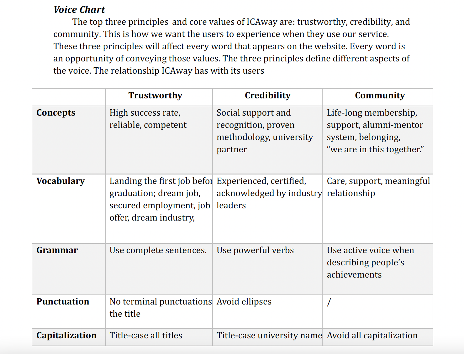
PART II: GET THE USERS TO ACT
We need to know who our users are, our users’ needs, hopes, and worries, so that we can convince them to act.
This part is based on the earlier research I did (more of that later.)

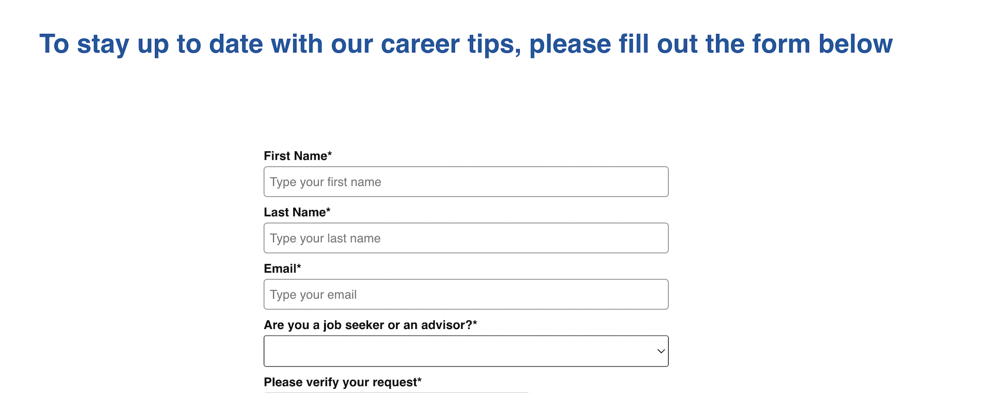
Microcopy
Four selected copy
.png)
This sign-up form worked like a charm. It boosted the sign-up rate by 40% in the first week. Before, it wasn’t even considered an important conversion method.
I did 4 things:
(1) Changed the title: the original title wasn’t bad – at least it wasn’t a default message of “sign-up now.” But it could be better. I changed it to show how signing up to our newsletter is good for them. I used one of users’ “hopes and dream” in the style guide to motivate the users.
(2) Told users exactly what they’re gonna get: I carefully selected the items that interest our users the most.
(3) No spam: It’s important to address the worry of receiving too many emails and being spammed.


This headline was right above the price and program, which was an important opportunity to motivate the users to convert. But the original text was generic and plain. I used a strong action phrase to get the users to act, showing users the result of using our service.I also deleted the second sentence which was self-explanatory to keep the content simple.


The original headline doesn’t give users a reason to care. It doesn’t tell the users how it concerns them. The new headline not only tells them what they can get out of this section, but also fosters the brand’s voice as a mentor that likes to give and help.


The original copy, “Learn More,” has a reputation of having low information scent. And that was true of this case. It was so vague that our users didn't click on it – users didn’t know what to expect next. They’d rather spend time looking around, searching for the page with all the programs, while this button would’ve taken them right there. To give the users a clear sense of what they’re getting, I describe the link’s destination, while motivating the users to click on it.
(Green stickers include quotations)
Lesson Learned at This Stage
1. During interviews, try to talk less and listen more (Don’t be afraid of silence)
2. Try not to praise the interviewee’s comments (Stay friendly, but neutral)
CONSTRAIN
Participant Bias
Since all of our 5 participants are currently enrolled in the program, they might have a more positive attitude towards the website, and might overlook some difficulties in navigation. It'd more ideal if I could include canceled users. For example, when being asked "did you skip any parts of the page?", most participants said no. I'd expect a more different answer from canceled users. But on other hand, we can make use of this bias: if users with more positive attitude target the same issue, that issue must be urgent.
All the quotes here are not intentionally solicited but are collected along the way
"Big shout out to Dahlia! Truly amazing work."


"The resistance, the reluctance that product owners have when confronting pain points...Dahlia's presentation approach helped with all that. She made me listen."

Lorem Ipsum is simply dummy text of the printing and typesetting industry.

Lorem Ipsum is simply dummy text of the printing and typesetting industry.